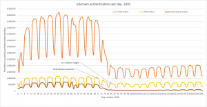
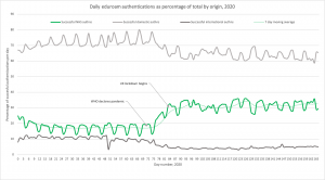
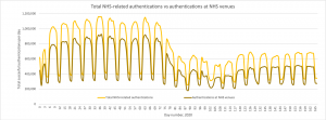
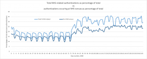
This post is really by way of an update to the earlier blog, love to #eduroam in the time of Corona. These updated graphs just show that the patterns we observed in the first weeks of the lockdown have been sustained over the longer term. Look out for a future update when restrictions are eased and, presumably, we will see a return to normal usage patterns… or will there be a ‘new normal’?


Categories
